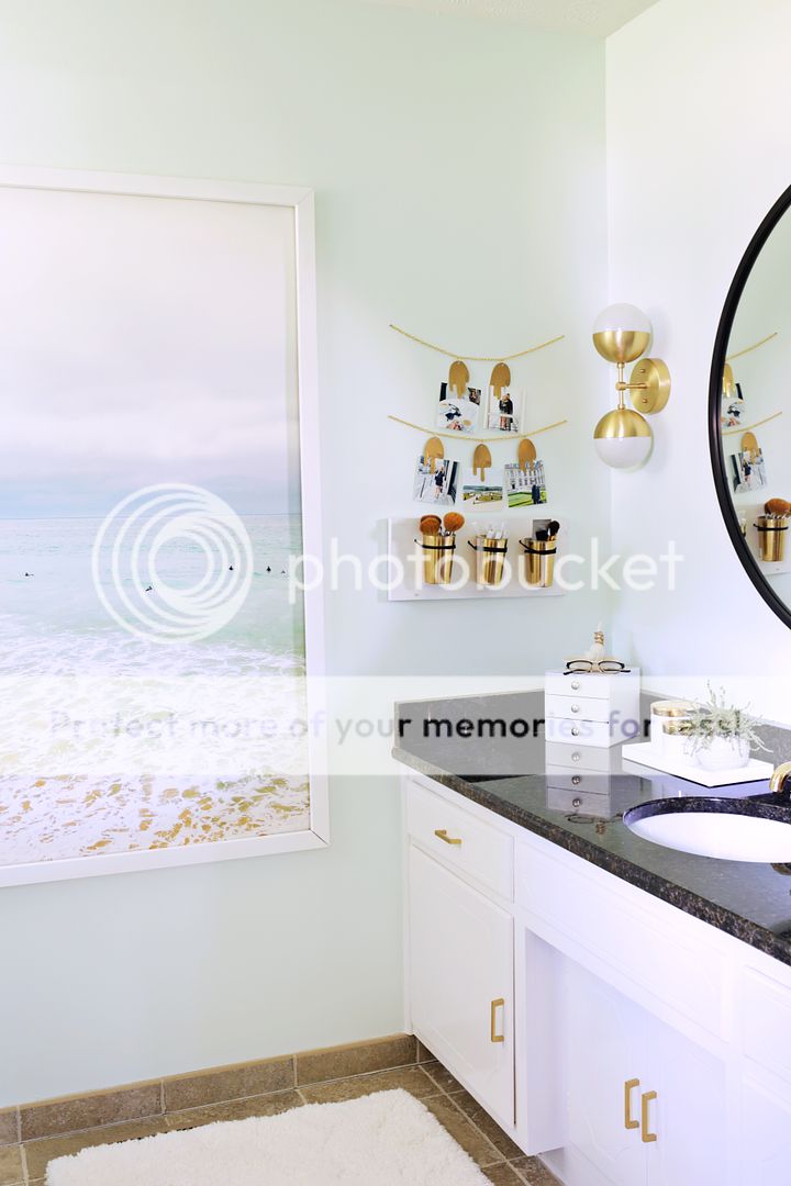
 If I have learned one thing from being on my second house renovation it’s that you don’t always get it right the first time. Sometimes things don’t turn out how you planned or maybe you just don’t like it once you get what you thought you wanted. I couldn’t wait to paint our bathroom when we first moved into this house but I rushed picking the color and ended up with a grey that looked really purple in sunlight and I just wasn’t happy with it. I think I left it for so long because I was tired of painting (we were painting the whole house at the time) and I just felt too tired to think up a new vision for the master bath. Fast forward about 8 months later and Dutch Boy Paint contacted me to see if I would like to partner with them for a room makeover featuring their Refresh® Paint + Primer with Arm & Hammer® Odor Eliminating Technology. When they asked me if I had a certain room in mind to paint, all I could think was, “boy, do I ever!”
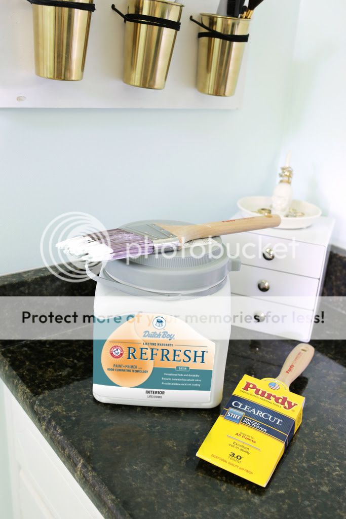
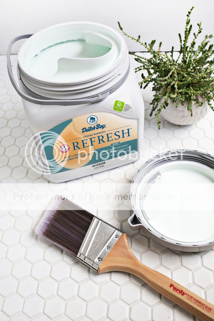 Dutch Boy makes the painting process smoother with their easy to open Twist & Pour container (the built in spout and handle are also great for pouring). When it comes to painting tools, an angled brush like Purdy’s Clearcut Glide is a must for me when cutting in a room. The brush has sharp edges for a smooth cut and helps make the job so much easier. To paint the walls, I used Purdy’s Revolution Frame and White Dove Roller Cover. This roller releases the paint evenly for an even smooth finish so you avoid any weird streaky lines or bare spots.
I still wanted a really light color to keep the small bathroom feeling bright and as spacious as possible, so I picked this really pretty light mint called Dutch Boy Aqua Quartz (DW53) as the new shade.
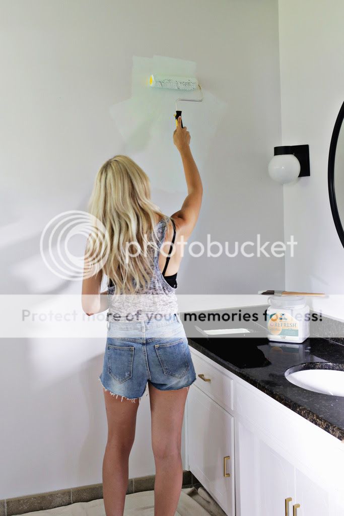 The nice thing about Refresh paint is that it actually reduces household odors and has a mildew resistant property, so that seemed perfect for painting a bathroom. Also, I definitely noticed that the “paint fumes” smell was not as strong as usual and by the time I went to bed I couldn’t even smell the paint anymore (which is great since the bathroom is right by my bed!). It’s also GREENGUARD® Gold Certified for Indoor Air Quality which goes along with my current regiment of trying to keep our indoor air as clean as possible—yay!
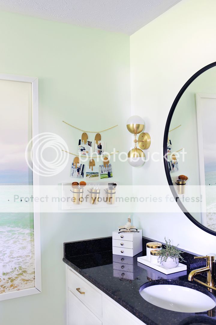
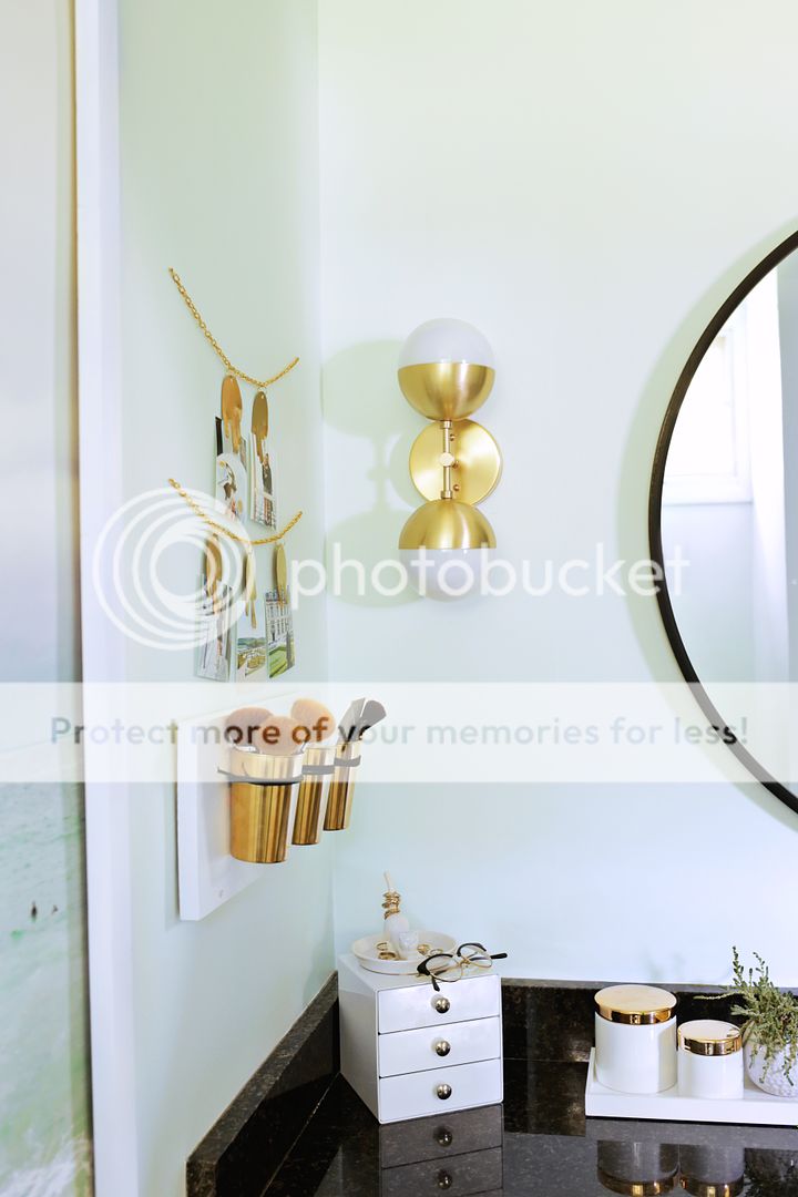
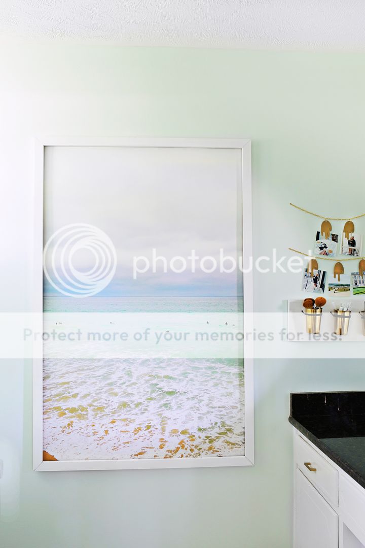
 Such a soothing color, isn’t it? The super soft mint was just what I needed to inspire me to switch out a few other decorative items and finally add this room to the “finished column.” Now it feels beachy and calming and is a beautiful place to start and end my day. Have you ever immediately regretted a design choice? Hope you got a chance to correct it like I did!

Haha – years ago, I painted my bathroom a really strong pastel green – like a lucky charms marshmallow! It was hideous. It lasted a couple of months, I think. Now it’s all neutrals all the time!
I hear ya!
Laura 🙂
hi Laura,
love the big print in the bathroom, is it an engineer print? & how did you frame it?
thanks
No, it’s from Urban Outfitters and I used this method to frame it:
http://www.abeautifulmess.com/2016/02/make-an-oversized-frame-for-a-fraction-of-the-price.html
Laura 🙂
Love the mint and gold. Are the picture chains and brush holders DIY’s? Would love to see how you made them, and where you sourced the products from if so, like the gold pails and gold clips.
They are DIYS!
http://www.abeautifulmess.com/2015/01/leather-copper-cup-organizer-diy.html
http://www.abeautifulmess.com/2016/02/metal-hand-photo-garland-diy.html
I replaced the copper cups with gold ones from urban outfitters eventually…
Laura 🙂
Ohhh… nothing like craving mint chocolate chip ice cream every time you walk into a room. 😀
Ha! So true!
Laura 🙂